Saturday, June 9, 2012

Intelligent Copying


Good Designers Copy, Great Designers Steal -- Pablo Picasso
Pablo Picasso, the first living artist to be featured in the Louvre, influenced the artistic world in a uniquely original way. Then why would someone as original as Picasso say something as ironic as that? And what did he mean? There are a plenty of opinions and interpretations as to what he really meant.

What Picasso did mean was that great artists rummage through the great junk heap of lost, bypassed, and forgotten ideas to find the rare jewels, and then incorporate such languishing gems into their own personal artistic legacy. Picasso implied that great artists don’t get caught stealing because they transform so thoroughly into their own persona, that everyone ends up thinking the great idea was theirs in the first place. To summarize in one sentence: copy the inspiration, not the outcome.

A wonderful example of intelligent copying would be the logo of Bajaj Auto.
If you carefully analyze, it closely resembles a rotated version of the very famous Volkswagen (VW) Logo. Volkswagen is a German automobile manufacturer and the original and biggest-selling brand of the Volkswagen Group, which now also owns the Audi, Bentley, Bugatti, Ducati, Lamborghini, SEAT, 49.9% of Porsche, Giugiaro, and Škoda. Volkswagen has seen a glorious 75 years journey and along with the cars they manufacture, their logo has also seen many stages of evolution.
The present logo (VW) is a perfect example of a Brand Mark Logo (Check out http://designclubiitm.blogspot.in/2012/06/types-of-logos-logo-102.html for types of logos). Now, when we consider the Bajaj logo and rotate it clockwise by 90 degrees it almost overlaps with the ‘V’ and ‘W’ of the Volkswagen logo.
It is worth appreciating the logo designers of Bajaj for making an intellectual copy of a strong rival, who cannot claim for what Bajaj have achieved using the logo. To support the theory, if you notice, the text and background colour of the Bajaj logo are just swapped from that of the Volkswagen logo. Bajaj must surely be proud of having a designer who has created a successful and powerful logo simply by looking in a different angle at the already hit logo. Kudos to him!

Saturday, June 2, 2012

Types of Logos: Logo-102


Hi friends this is my second post on logos. The first one was a tutorial on designing the logo of ‘Design Club IIT Madras’. I hope you have tried that and learned something out of it. There are no pre-requisites to Logo-102 and there are no tests, quizzes or Endsems. So just sit back, relax and know some facts about logos so that next time when the topic is raised, even you can participate in the discussion.
A logo is the visual representation of a company/brands values, beliefs and functions. It serves as the first recognition point for any entity looking to build awareness of their brand. I prefer calling it the simpler and aesthetic version of something. Instead of having the human mind remember a name or face, a unique and well thought out logo does a much better job. A great example of logo design is the McDonald’s logo, one of the most known logos in the world. It is a brand so powerful, young children instantly recognize the golden arches (some can’t even read). The beauty of the logo lies behind it’s simplicity and use of color which creates an instant visual representation of the corporation. Some people even go as far as to believe that red and yellow elicit hunger. You be the judge on that one.

Today, when I was googling types of logos, I came across many search results which said ‘3 basic type’, ‘5 basic type’ etc. After going through all the posts, I could classify the logos in four basic types. Let us have a look at some examples of each type.

Brandmark Logos

This type of symbol represents the company in a simple but bold manner. Most often represented through an abstract design. Usually, the ideas and concept behind the logo are complex, yet are represented in the simplest form possible. Examples of a brandmark include Shell, Mercedes-Benz, Volkswagen, MSN, Apple etc. The human mind can easily remember a simple form better than a complex one. It is best to use a brandmark symbol if you plan on building a global brand and have the funds to back it up. In order for a symbol to be a truly effective logo, it should conform to these maxims:
  • Instantaneously recognizable.
  •  Memorable.
  • Clarity when reproduced in small sizes.

Wordmark Logos

Wordmark Logos incorporate the brand name into a uniquely styled type font treatment. Type fonts come in thousands of possible variations, shapes, sizes, and styles, each conveying a slightly different impression upon the intended audience. Technology companies usually use this type of logo, as stylized text looks best on electronics and expresses the sophistication of a company. Examples of a wordmark include Google, Sony, Samsung, Microsoft, Coca Cola, Disney, FedEx etc. 

Lettermark Logos

These logos are exclusively typographic. The lettermark uses the company name written out, yet has a symbol representing the company through the use of its initials or the brands first letter. The best usage for this type of logo depends on many different variables such as; the initials can graphically illustrate the company better than the full name, the name is too long, hard to pronounce, or is just not distinct enough to carry its own weight. Some common Examples are HP, IBM, Honda, Hyundai, Suzuki, GE etc. 

Combination Mark

They are combinations of a Brandmark and Wordmark logos. The purpose of the combination mark is to create an identity that embodies a given company through the use of a symbol and type treatment. In certain situations and with proper investment of time & money, a strong combination mark can use its symbol to represent the company without the use of text. Great examples include; Mc Donalds, Mexicana Airlines, Bank of America, AT&T, Pringles etc.


Monday, May 7, 2012

Learn to create the corporate glossy text effect

Ever envied these logos for their professional and subtle glossy effect? No more! Because in the next 20 minutes, you will be able to make your own logo with the same effect :) So here we go...

Step 1

Lets starts by creating a new document in Photoshop. (File>New) Alternately, you may even press Ctrl+N. I am using 640x400 px, 72dpi, RGB 8bit, white background. Once you are done filling in the parameters, go ahead and click ‘Ok’. A new blank document opens in the work area.

Step 2

Next, select the Horizontal Type Tool and Type in your name in the work area. I am using 'design club' instead of my name. Go to Windows>Character to make the Character panel visible. Type in your name with any font you like, preferably a thick/bold one. I have used the font Ubuntu, bold, 55 size and (-50) character spacing. The font size depends on how big you want your logo to be.

Step 3

Select the Pen Tool and draw a path as shown in the screenshot. The way the pen tool works may seem a little counter intuitive to the first time users. Start by clicking at any point in the work area. Now when you click on some other point, Photoshop creates a straight line joining these two points. In the second point, instead of just clicking, if you click and drag, you get a curve. Play around with it for a while and you will get it.
Now, Ctrl+Enter to convert this path into a selection. Now while this selection is active, press and hold Shift+Ctrl+Alt and click on the text layer of your name. This will make a selection around the intersection of the path you have made using the pen tool and the text layer of your name. If you do it correctly, you will get something like this.

Step 4

Now, we have to fill this selection with a suitable linear gradient. Select Black as the foreground colour and any Dark Gray as the background colour. I have used #414141 for the background gray. Select the gradient tool and select the linear gradient mode at the top. Now create a new layer above the text (name) layer. With the gradient tool selected, click at the bottom of the text and drag it till the middle of the text.
In the screenshot, the gradient is not quite visible. But when you do it yourself, it will be visible in your screen.

Step 5

Now, we need to do the same thing with the other half of the text as well. Go to the Paths tab (Windows>Paths if it is not visible by default) press and hold Ctrl and click on the Work Path thumbnail. This will again create the selection you had before. Press Ctrl+Shift+I to invert the selection. Now while this selection is active, press and hold Shift+Ctrl+Alt and click on the text layer of your name. This will create a selection around the remaining half of the text.

Step 6

Now, we have to fill this selection with a suitable linear gradient. Select #3c393b as the foreground colour and  #757577 as the background colour. Select the gradient tool and select the linear gradient mode at the top. Now create a new layer above the text (name) layer. With the gradient tool selected, click at the tittle of 'i'  and drag it till the middle of the text.

Step 7

Now select the the layers in the layer palette which contains the two halves of the text gradient, by pressing Ctrl, just like you select multiple icons in Windows. Press Ctrl+E to merge them.

Step 8

Right click on the recently merged layer in the layer palette and select Blending Options. Select Drop Shadow and enter these parameters.

Your logo is ready. Get ready to flaunt it! Dont forget to share it with us in our Facebook page http://www.facebook.com/DesignClubIITM. Happy Designing.

Saturday, May 5, 2012

Learn to make our logo


Hi friends, this is my first post and as I ve promised I am going to teach you how to make the logo of Design Club, so here I go.

I believe a good design should be always simple, precise, clean and straight to the point. Personally, I feel that using a few basic, simple shapes and colours is the best way to reach your audience and convey the right message - because you are trying to say something without artifice or special effects. When it comes to a logo, it should be an appetizer, not the whole buffet! Our logo is not an exception. It has just one kind of shape. A Circle, that’s it! So, if you have ever opened MS Paint and drawn a circle, you are equally capable of doing it. So let’s start.

Step 1

First, we need to create a new document in Photoshop. (File>New) Alternately, you may even press Ctrl+N. I am using 1280x800 px, 96dpi, RGB 8bit, white background. I wish to use it as my desktop wallpaper that’s why I have used 1280x800. You may go ahead and use the screen resolution of your own comp. Once you are done filling in the parameters, go ahead and click ‘Ok’. A new blank document opens in the work area.

Step 2

Next, we select the Elliptical Marquee tool and draw a perfect circle. Perfect circle can be drawn by pressing and holding shift, just like in MS Paint. (Please note that instead of Elliptical Marquee, the Rectangular Marquee tool may be present by default. Click and hold on the Marquee tool icon to select the Elliptical Marquee tool. Check out the screenshot).

Step 3

Click on the colour swatch at the bottom of the left tools panel and select a dark shade of red (#7f030b). You may directly type in the hex code of the colour (without the #) which is used in the logo.

Step 4

Click on the ‘Create new layer’ button on the layer palette at the right (If layer palette is not visible by default press F7) and fill in the red colour using the Paint Bucket tool. (Please note that instead of the Paint Bucket Tool, the Gradient tool may be present by default. Click and hold on the  tool icon to select the Paint Bucket Tool. Check out the screenshot). The circle which you have made using the Marquee tool is just a demarcation which decides the area where the colour will be filled. The same Marquee tool can be used to select any area / shape etc in Photoshop. The selected thing can then be filled with colour, deleted, cut, copied etc.


Step 5

Now, we just need to make some concentric rings and we are done. The easiest way to make a ring is to make two concentric circles of two different sizes in two different layers and delete the region of the smaller circle from the bigger one. To create concentric circles just duplicate the layer in which the red circle is present by pressing Ctrl+J. When you duplicate the layer, it won’t be visible in the work area because both the circles will be exactly same and they will be in the same position. You may change the colour of the duplicate circle to differentiate it from the original. I ll go ahead and make it black. 

Go to the Duplicate Layer on the layer palette. Press and hold Ctrl and click on the layer on the layer palette. This will make a selection around the circle, a similar one which you have made using the Elliptical Marquee tool. Now fill it with black. Now we will reduce the size of the black circle. Press Ctrl+T and you will be able to resize the circle just as you do it in MS Word. To keep it concentric press and hold Shift+Alt. Once you are done with the resizing, go ahead and press Enter.
Now, we again press and hold Ctrl and click on the layer of the small black circle on the layer palette. This will again make a selection around the circle. Now, click on the layer of the red circle on the layer palette. When the selection is still active, press delete. This will remove the area of the small black circle from the big red circle. Now, you can completely delete the layer of the black circle and you are left out with a red ring.

Step 6

Similarly create another ring and place both them like the way they are placed in the logo. So now the layer palette has 3 layers. The red circle, Ring 1 and Ring 2.

Step 7

Now we just have to reduce the opacities of the individual layers. Set the opacity of the layer of the red circle to 70%. Ring 1 to 50% and Ring 2 to 20%. 

Step 8

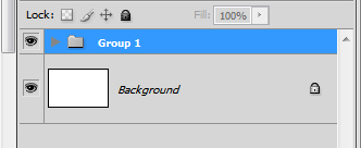
Now select all the three layers in the layer palette by pressing Ctrl, just as you select multiple icons in Windows. Once selected, press Ctrl+G to group the 3 layers. (Grouping is not mandatory; it is just for better organization. It is similar to creating a folder in Windows) Now 'group 1' has the red elements. Similarly create 3 more groups for the Blue, Green and Yellow circles. You may re-size a  group by pressing Ctrl+T. You may use #538ba5 for blue, #90bd52 for green and #ecbd0f for yellow.
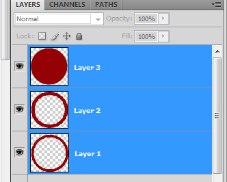
Selecting the 3 layers

Grouped Layers

Step 9

After creating all the 4 groups, place them in their proper positions.

Step 10

Go to Windows>Character to make the Character panel visible. Type in ‘design’ with Century Gothic font, bold, and (-75) character spacing. The font size depends on how big the circles which you have made are. I have used Ctrl+T to resize the text layer to best fit into the logo. Similarly, type ‘club’ with Century Gothic font, bold, and (-50) character spacing and align the two words so that ‘i’ in 'design' lies in the same vertical line with the ‘l’ of 'club'. Now we will make some minor changes to the words so that they become unique. 
Please note that a text layer is not directly editable because it in the vector mode. We need to convert it to the raster (pixel) mode. To do this we select the text layers, right click on them and select ‘Rasterize type’.


Step 11

Next, select the ‘l’ of ‘club’ using the Rectangular Marquee tool and delete it. Now, we select a small part of the ‘i’ of ‘design’ using the Rectangular Marquee tool, press Ctrl+T and extend the ‘i’ to form the ‘l’ of ‘club’. Similarly, extend the ‘b’ of club to merge with the ‘n’ of design. Now select the layers, design and club, in the layer palette and press Ctrl+E to merge them. Now type ‘the’ and ‘iitm’ and place them in appropriate places. Rasterize ‘the’ and extend the ‘t’ and ‘h’ of ‘the’ beyond the red circle. Now merge all the 3 layers again by pressing Ctrl+E.

Step 12

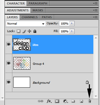
Next, Select the four groups, Groups 1 – 4, and press Ctrl+E to merge them. So, now you are left out with just 2 layers in your palette, the layer with the text and the layer with the circles. 

Step 13

Now, press and hold Ctrl and click on the text layer in the layer palette to make a selection around the text. Now while the selection is active, go to the circles layer and press delete!
Now, go to the text layer and completely delete the whole layer by clicking on the delete button and Tada... you have successfully made the logo!
Step 14

Now let’s give it a wallpaper look by applying a subtle gray gradient in the background. Resize your logo and place it in the centre of the wallpaper (or any other area of your choice). Select white as the foreground and any light gray as the background colour. I have used # dbdbdb. Select the gradient tool and select the radial gradient mode. Now create a new layer below the logo layer. With the gradient tool selected, click on the centre of the wallpaper and drag it to any one of the corners to fill in the new layer with the radial gradient.
If you feel the logo is looking very pale just duplicate the logo layer by pressing Ctrl+J and set the blending mode of the new layer to ‘Multiply’. This will brighten it up. 
Once you follow all these steps, you should get something similar to the image below. This concludes our tutorial. I advise you to experiment with this logo by applying your own touch of style to it, and make sure you show off your work in our Facebook page http://www.facebook.com/DesignClubIITM. I hope that you've learnt something new from my tutorial, feel free to email us on designclubiitm@gmail.com.